Simon Somlai
Design system

Brick

The colors, type, spacing and components behind this site. Everything on this page is rendered with the real styles and real content, so it can't drift from what ships.

Principles

  • Reading first. A 66 character measure, a serif face, generous line height and nothing competing with the text. While you read an article, the navigation slides away.
  • Consistent widths. Every page uses the same 58rem container. A single article narrows to 46rem so the text sits closer to the middle of the screen; the article list stays at 58rem.
  • One accent. Brick red for links, actions and pins. A warm yellow is only for hand-made touches: the highlighter, the hero sticker and the side-project stamp. The slab carries the deepest color.
  • Hand-made details. Stickers and stamps are slightly tilted with a hard shadow. Everything else is calm and rounded.
  • Plain files in, static pages out. Content is Markdown. Nothing on a page needs a script to be read.
  • Light only. One carefully tuned palette instead of two half-tuned ones.

Color

CSS custom properties on :root

Surfaces

  • Page--bgPage background
  • Surface--surfaceCards, code blocks, inputs, tags
  • Line--lineDividers and borders

Text

  • Ink--fgBody and headings
  • Muted--mutedDates, summaries, captions

Brick accent

  • Brick--accentProgress bar, focus ring, back-to-top fill
  • Brick ink--accent-inkLinks, buttons, labels, pins (passes contrast on white)
  • Brick soft--accent-softHero shape, soft fills, inline code
  • Pop--popHighlighter, sticker, side-project stamp, active dot

Sidebar slab

  • Slab--sidebSidebar, drawer and feature cards
  • Slab text--sidefgText on the slab
  • Slab muted--sidemutedSecondary text on the slab

Code

  • Code text--astro-code-foregroundPlain code
  • Keyword--astro-code-token-keywordfunction, if, return
  • String--astro-code-token-stringQuoted text
  • Function--astro-code-token-functionNames being called
  • Constant--astro-code-token-constantNumbers, booleans
  • Comment--astro-code-token-commentNotes in code

Link and button text on white uses --accent-ink (contrast 5.4:1). --accent is for large or decorative use. Greys are tinted toward brick on purpose: there is no neutral grey in the palette.

Type

Reading and display

Literata

A serif made for long reading on screens. Headlines, body text, quotes.

Interface

Work Sans

Navigation, buttons, tags, dates, card titles.

Labels and code

JetBrains Mono

Eyebrows, dates in lists, code. Ligatures are off in code so symbols read literally.

  • DisplayLiterata 500, clamp(2.4rem, 7vw, 3.7rem), line 1.12, tracking -0.03em
    I build for the web
  • Page titleLiterata 500, clamp(1.9rem, 5vw, 2.6rem), tracking -0.02em
    All projects
  • Section titleLiterata 500, 1.6rem
    My latest projects
  • Card and row titleWork Sans 600, 1.1 to 1.2rem. Article titles are title-cased everywhere.
    Housing Is Broken
  • Body (reading)Literata 400, 1.125rem (1.0625 to 1.375 by reader setting), line 1.72, measure 66ch
    The last 2.5 years I spent renovating an old home, with the belief that it was a smart thing to do.
  • InterfaceWork Sans 400 to 600, 0.78 to 1rem
    Download resume
  • LabelJetBrains Mono 500, 0.72rem, uppercase, tracking 0.08em
    Software engineer · Writer · INTJ

Layout

TokenValueUsed for
--w-page58remEvery page, including the article list
--w-article46remA single article
--measure66chRunning text in articles and shorts
--sw19remDesktop sidebar. Under 1000px it becomes a full-screen drawer.
Gutter1.25rem on phones, 3rem on desktopSpace between the screen edge and the content
Radius12px images, 16 to 22px cards, 999px buttons, tags and stampsSoft corners, never sharp
Breakpoint1000pxSidebar appears and the home hero becomes two columns

Components

Buttons, chips and links

Eyebrow, highlight and sticker

Software engineer · Writer · INTJ

I build for the web, and explain how it works.

Hi, I'm Simon 👋

The sticker sits over the lower left of the portrait, never over the face, and centers under the portrait on phones. The hand waves twice.

Newsletter modal

Join the newsletterAny link marked data-newsletter opens it. Without JavaScript it is a plain link to Substack.

Carousel controls

Rows scroll by touch, trackpad or these buttons. No scrollbar. The buttons disable at either end and hide when there is nothing to scroll.

Back to top

Appears bottom right after about a screen of scrolling and eases back to the top.

Quote

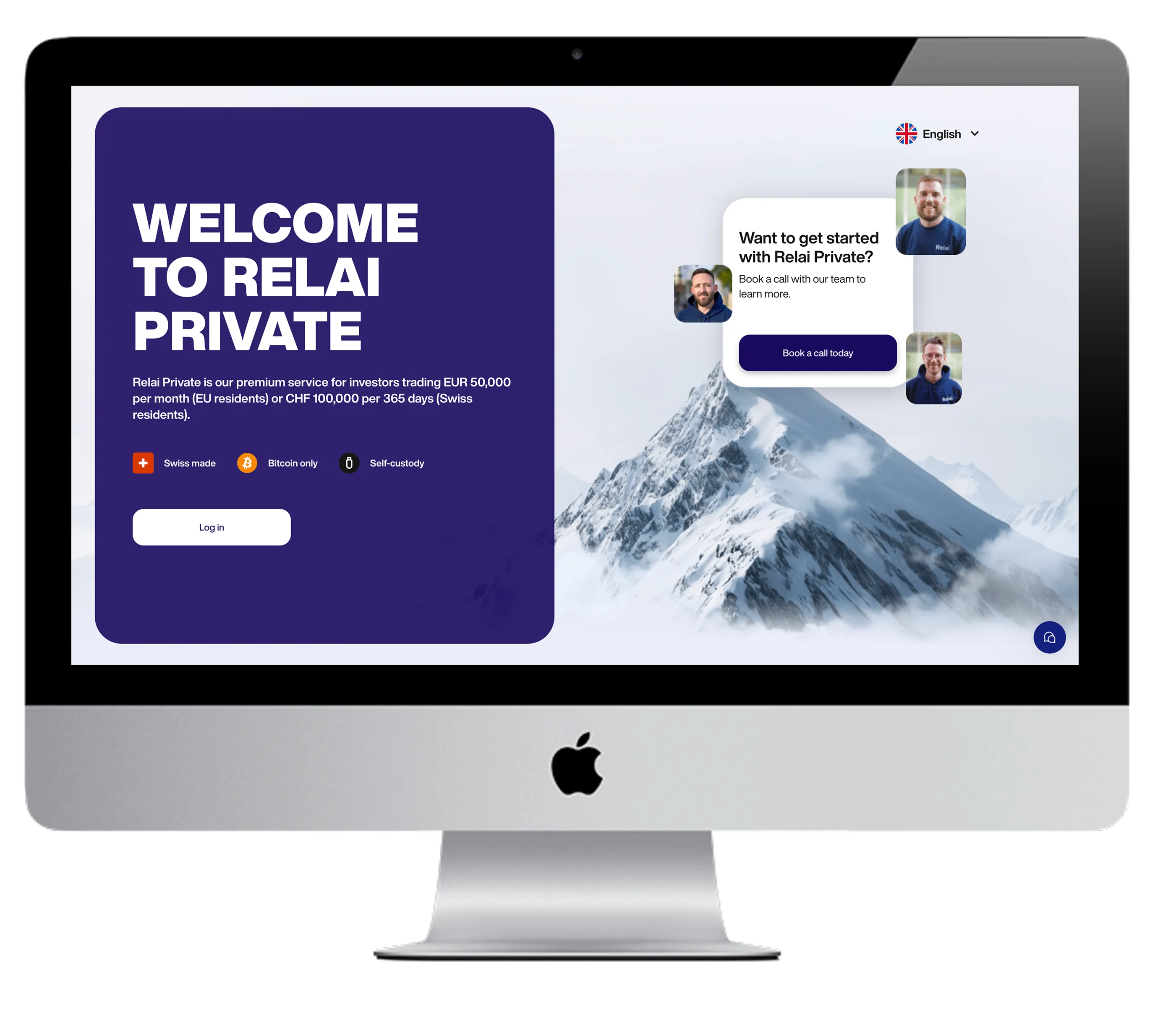
  • I had the pleasure of working with Simon during his time at Relai, where he made a strong impact in just 7 months. From day one, he onboarded quickly, asked the right questions, and immediately took ownership of key components in our web app most notably the wallet signing flow, which is critical to our product.

    Despite the short timeframe, Simon proved to be a reliable and thoughtful developer. He worked autonomously, delivered high-quality code, and always kept the user and security in mind.

    I appreciated his calm, focused approach and his ability to integrate smoothly into a fast-moving team. Any team would be lucky to have him.

    Adem BilicanCTO @ Relai
    See the project →

Badges and indicators

Side projectA yellow stamp with a flask, only on side projects. On a card it sits on the top-left corner of the image.
Pinned items get a pin icon, never a tag. On a project card it sits on the top-right of the image; in a list it sits before the date.

Content cards

Article row, with image and pin

Project cards
Video card

Start-here cards and the newsletter block

Newsletter

One useful idea in your inbox.

I write and teach about technology, finance and privacy.

Subscribe →

Reading

Body text is Literata at 18px with a line height of 1.72. A paragraph keeps to about sixty-six characters per line, which is where the eye tracks best, and links are underlined in Brick ink.

A section heading

Headings switch to Work Sans so they read as signposts, not as part of the text.

Quotes get a Brick rule and an italic voice.

Inline code sits on a soft brick chip. Highlights use a pale yellow.

ElementBehavior
TablesScroll inside their own box
CodeScrolls sideways, never wraps
ImagesOpen a lightbox on click

Code

Highlighted with Shiki's css-variables theme, so the colors come from the tokens above and sit next to the serif and sans text. JetBrains Mono at 0.86rem, line height 1.75, ligatures off.

function reading(settings) {
  // 66 characters per line
  return settings.measure === '66ch';
}

Icons and app icons

  • youtube
  • substack
  • github
  • linkedin
  • medium
  • rss
  • pen
  • arrow
  • external
  • download
  • mail
  • search
  • menu
  • close
  • panel
  • up
  • pin
  • flask

Brand marks (YouTube, Substack, GitHub, LinkedIn, Medium, RSS) are filled; interface icons are 1.7px line icons. Stack Overflow was dropped from the set.

Favicon and app icons

Favicon, 32pxAndroid iconApple touch iconYour face, cropped to a circle for the favicon and Android, and on the slab color for iOS.

Behavior

  • Distraction-free reading. On an article, scrolling down slides the sidebar away and fades it out (the top bar on phones), and the page glides to the true center of the screen with a transform, so nothing reflows. It stays hidden while you scroll back up. It returns near the top of the page, or by hand with the panel button.
  • Manual sidebar toggle. A small panel button next to the sidebar shows or hides it by hand. That choice holds until you scroll back near the top.
  • Drawer. Under 1000px the round menu button slides the sidebar in from the left, full screen. The close button, Escape or choosing a page closes it.
  • AI policy. A small pill in the article byline reads “Human-written, AI-enhanced”.
  • Reading progress. Articles show a thin progress line along the top. There are no size or font switches: the type is set once, for reading.
  • Newsletter. Buttons marked data-newsletter open a light modal (white panel, brick button) with the subscribe form. Esc, the close button or a click outside closes it. /#newsletter opens it too.
  • Articles end with a native newsletter signup card and a Bitcoin tip. On phones the tip is a wallet button with the QR code one tap away; on desktop the QR code shows next to it.
  • Comments load only on simonsomlai.com.
  • Motion. Every transition uses one ease-out curve (--ease). Start-here cards lift, their icon tile turns brick red and moves (page turns, play pulses, case bobs, wrench turns) and the arrow slides. The waving hand plays twice. All of it stops when the reader asks for reduced motion.
  • Focus. Every interactive element shows a Brick outline when reached by keyboard.
Newsletter

Get new articles by email

I write and teach about technology, finance and privacy. Free on Substack, unsubscribe anytime.

You'll confirm on Substack, in a new tab.

Prefer a feed? RSS